Dissertation website
Python-powered custom static website
My dissertation research concerned the disappearing traces of the lives and work by gender-nonconforming performers in 1930s United States, which propelled my interest in giving history a digital present and digital projects a history in the future.
In this research project, I employed data-rich methods to find foundational queer structures using social network analysis, visualization, and wrote in-depth case studies around particularly important figures emerging from this network analyis.
My data-assisted approach required me to develop fluency in programming languages such as Python, JavaScript, PHP, Swift, and data analysis applications and frameworks like Gephi, Tableau, and d3. My high comfort level in these technologies allowed me to build an entire workflow, from data ingestion to analysis.
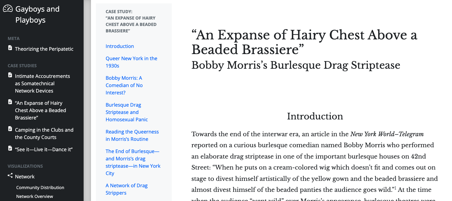
As part of my research project, I also built a companion browser-based visualization tool that contains the text for the dissertation and its accompanying speculative visualization structures. The work on the website is still in progress, but an early version is made available on this site: kallewesterling.github.io/drag-data-browser
Research Process
The research process is described in detail on the site, but this poster, “Visualizing the Routes of Boylesque,” explains the process of coding the data in a clearer way. All of the data can be seen and downloaded from this Google Sheet.
Network visualization
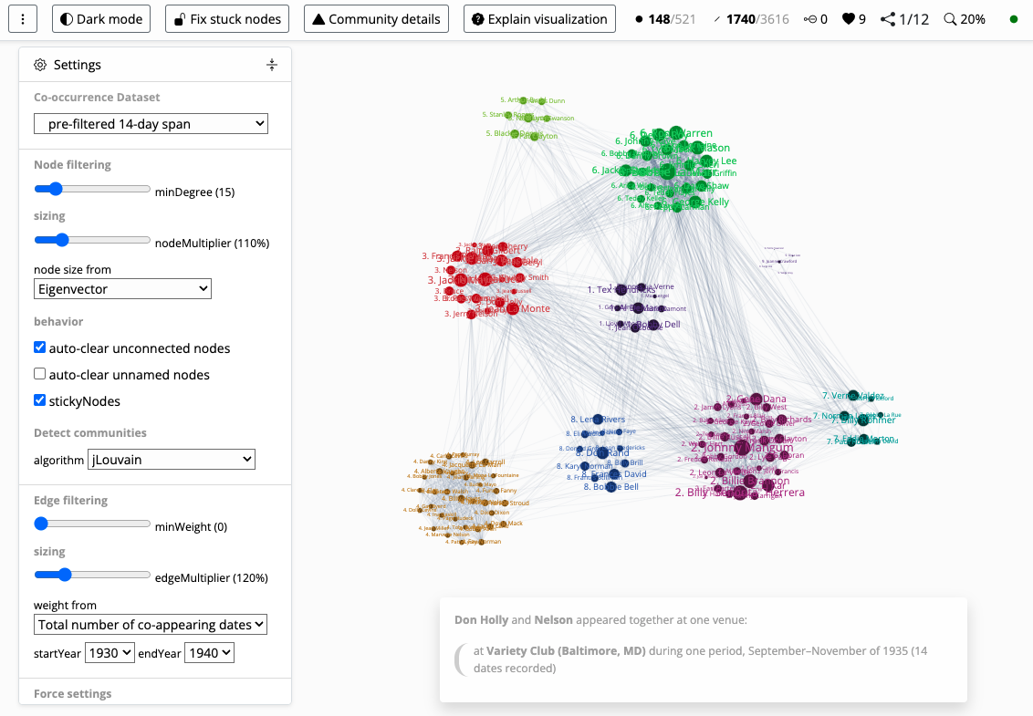
One important component in the project is the network visualization tool, which shows the connections between performers who appeared together in nightclubs and theatres across the country. Because I wanted to focus the visualization on the social aspects of the culture, the only “nodes” (the circles that are connected by the lines) that are found in it, represent performers. The lines, thus, provide the data for the “co-location” of the performers.
The interface encourages a playful attitude to the data. We know that there is much data missing in the dataset but we can still see some foundational structures. For instance, some clear groupings emerge, and we can start to identify key figures in those groups (the leaders), and some important key people who connect different parts of the network (the gatekeepers).
I built the entire interface on top of the d3 Javascript library, with an additional 35,000 lines of code. All of the source code can be found in this GitHub repository.
Sankey visualization
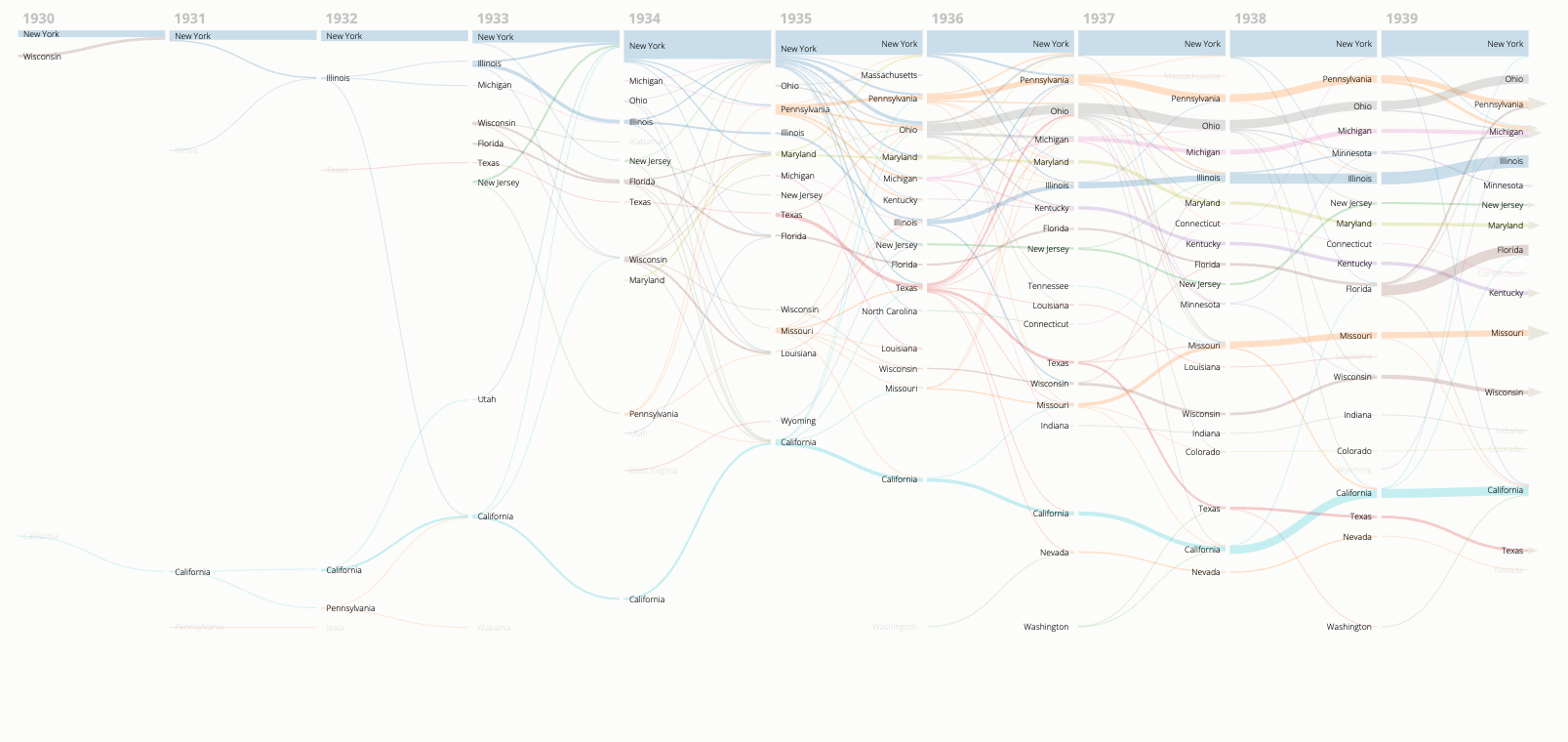
Another important part of the dissertation website’s visualization component is the Sankey graph. Commonly used to show flows of different kinds (energy, water, political influence, etc.), I opted to use this type of graph to illustrate flows of artists between states. In the initial view of the graph, one can see lines going from U.S. state to state. Time flows from left to right in the graph, and the thickness of the lines illustrate the amount of artists that moved from one state to another, from year to year. For the purposes of simplicity, only the whereabouts of a performer at the beginning and the end of any given year are visualized here.
On top, one sees New York as a thick, blue layer of artists, which confirms the commonly understood situation of the city as a cultural and artistic hub in Depression-era United States. However, the visualization also seems to suggest that many states are becoming increasingly important over the course of the 1930s, besides New York. Pennsylvania, Ohio, Illinois, Florida, Missouri, and California are all states that are becoming thicker as the decade goes by.
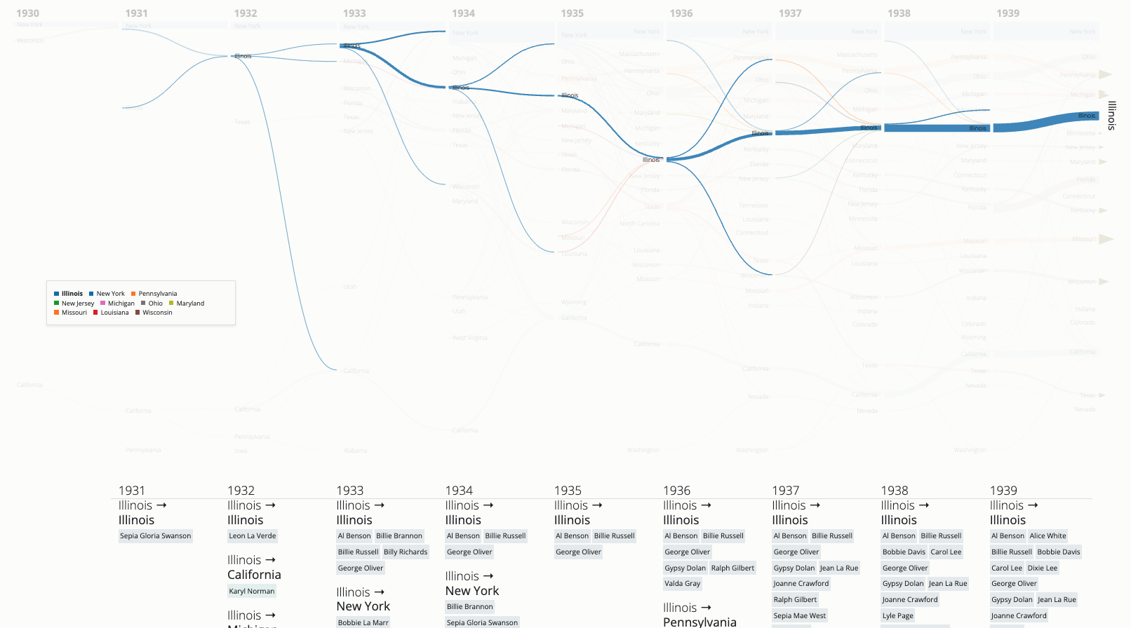
As one hovers over the lines, the visualization will show the names of the artists who traveled between the states on that particular year. And with a click, the transitory nature of the entire state is shown in a “dashboard” kind of way:
Sustainability
To ensure the sustainability of my doctoral research, I modelled my project on Princeton University’s Project Charters, which stipulate essential aspects of the digital research workflow, including commitment, expectations, and scoping plans to sunset the tool or environment at hand. The most crucial point in the research project has been to make the data open-access and available in non-proprietary standards that enable future scholarship and a life expectancy that exceeds any limitations of potential proprietary software.
If you are interested in reading more about the underlying site, the data that I processed, and the source code for the tool itself, they have all been made available open-source and open-access on GitHub and on Google Sheets.


